Strolling through the streets and lanes of the city, you can always find signages of every hue. Their design constantly evolves as time changes, adding unique layers to the streetscape of Hong Kong. While this exhibition focuses on signages within the compound, have you ever wondered how the signages beyond Tai Kwun become what they are today?
Shop Signs
To drum up business in the past, shop owners would put their products at the storefront to grab passers-by’s attention. However, not all shops could adopt this strategy; some of them hung a fabric sign with graphics or text outside their stores instead, becoming the archetype of shop signs we see today.
Early shop signs were mostly vertical and timber signages. After World War II, as the economy began to boom, a larger variety of materials were employed in signage production, such as neon light and plastic light boxes. A myriad of signage designs therefore blossomed, creating a dazzling cityscape filled with dynamic shapes, bustling layout, and vibrant colours.
As technology advanced, old signages gradually fell into disuse. In the mid-1980s, the sign-making industry went through a period of digitalisation. With new technology, production time was shortened with quality improved. Traditional handwritten signages have therefore become obsolete. In the 21st century, LED lighting has been widely used for its price, durability, and energy-efficiency, and neon signages passed out of use. In 2010, Minor Works Control System was fully implemented by the government. Many signages that existed after WWII but were deemed to be an illegal installation had to be removed. As a result, neon signages are gradually disappearing from view and becoming part of our local heritage.
Road Signs
As a former British colony, many road signs in Hong Kong today have retained a British standard design.
As early as the 1940s, Hong Kong’s road signs adopted Maybury’s standard design from the United Kingdom. Sir Maybury was an expert in the management and upkeep of the road network, and in 1920, he proposed a new road sign system for the Ministry of Transport in the UK. However, this system was complicated and confusing as one message would often be broken into several elements. In addition, it was not very user-friendly since text, rather than graphics, was used as the major medium. The Public Works Department of Hong Kong had therefore proposed re-designing road signs in 1973, with reference to Worboys’ standard design.
Worboys’ standard was also derived from British design. As the then Chairman of Council of Industrial Design, Sir Worboys was appointed to chair the Traffic Signs Committee of the UK in 1961 to review the design of road signs. After multiple trials, the Committee proposed a new set of standard design, with one of its elements being the use of simple pictograms to make information simpler and more direct.
Hong Kong adopted Worboys’ standard in 1974 on a trial basis. The design has been modified over the years to become the design we see today. A modified Worboys’ standard is still in use now in the UK.
Street Signs

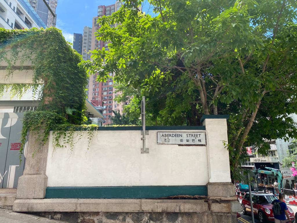
Chinese street name aligned to the right.
T-shaped signage was one of the earliest street sign designs in Hong Kong, with capitalised letters in English on top and Chinese characters written from right to left at the bottom. In 1961, T-shaped signages were gradually replaced by rectangular signages, with English on top and Chinese at the bottom, with the latter aligned either left or right.
In 2005, the Highways Department initiated a replacement of streets signs. Most of the signs have been changed to how they look today. Apart from showing street names, there are also arrows and building numbers on both sides of the signs. Unlike the earlier design, the new street signs are double-sided, so that pedestrians can also view the information from the pavement. Although most street signs have been replaced, we can still spot a few old-style street signs that have remained in the city today.
Relevant Books and Projects
- 《你看港街招牌》,李健明
- 《香港道路探索 路牌標誌 × 交通設計》,邱益彰@道路研究社
- 《街坊老店II —— 金漆招牌》,吳文正
- Typography and the Sea of Words – A Study of Hong Kong Urban Landscape, CACHe
- NEONSIGNS.HK 探索霓虹 M+ Hong Kong
